as detailed below in the initial plan for the inlay, I had an A3 sheet of space to play with and a vague idea of what I had in mind. i was still feeling love for the "triangles" logo, so pushed the boat out with regards to drawing this out in that arduous style also detailed below. the idea for this inlay is that i draw it all out on A3 and can then just easily copy it myself on any old photocopier - keep it simple, keep computers Out of it!! of course, this means that the previously drawn-out "triangles" logo in the previous blog entry wasn't useable, needed to be done out again. this took fucking hours. well, maybe 3 or 4.
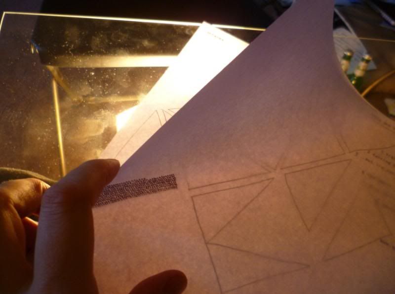
as previously detailed, I used a lamp and a sheet of glass to drawn over a projected outline, but this time didn't outline the actual finished work as decided that felt stifling in the design
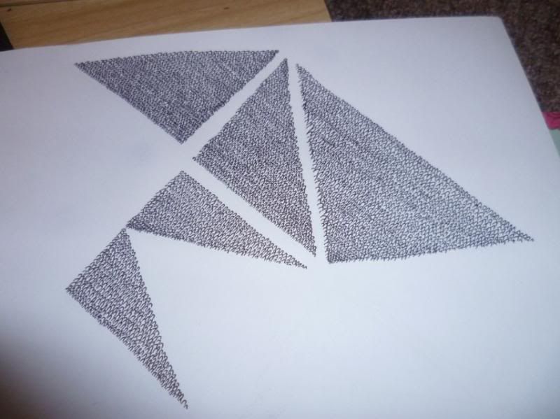
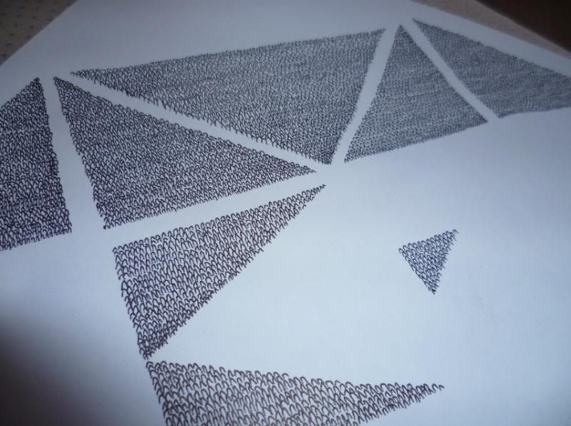
i'd worked out the folds and roughly where everything was going to sit, so was fucking rad to see the big ole logo in pride of place atop the A3 sheet waiting for its content to be filled in...
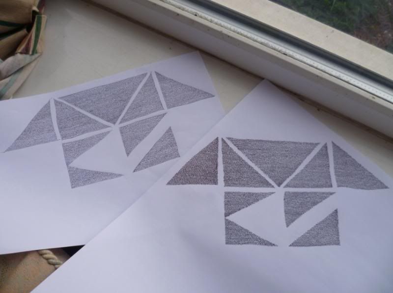
toyed with the idea of switching pens, compared a few, but stuck with the Mitsubishi Jetstream i'd used thus far
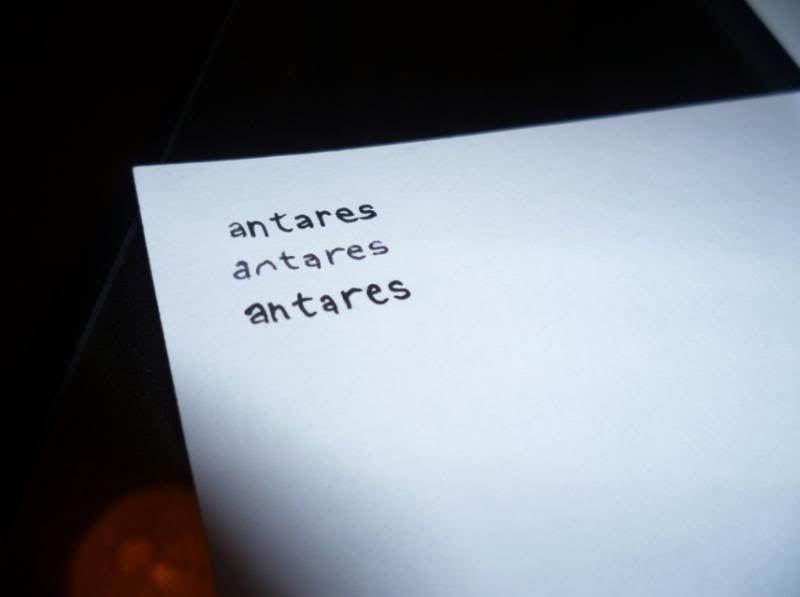
i've always loved using my typewriter for inlays, especially for lyric sheets, but for this I was wanting to challenge myself and try something a bit new to me so decided to trace out the lyrics from a typewriter'd source. if i'd have done this with my head firmly screwed on i'd have no doubt used some lined paper to make sure these words were all put in straight, but...yeah...so that was an interesting part of the project, and the wavey left-hand margin was an adaptation after i saw i was screwing the damn thing up!
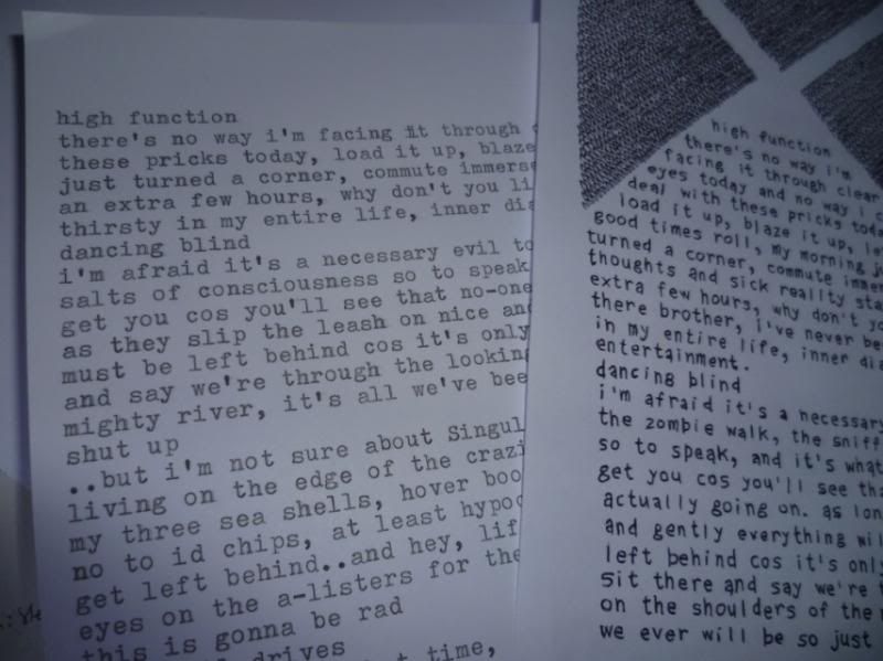
as i said above, after the initial explotion of momentum the energies start to wane, but for whatever reason i managed to bring myself back to it across a month..probably because it was sat in my livingroom taunting me as the unfinished challenge the whole time!
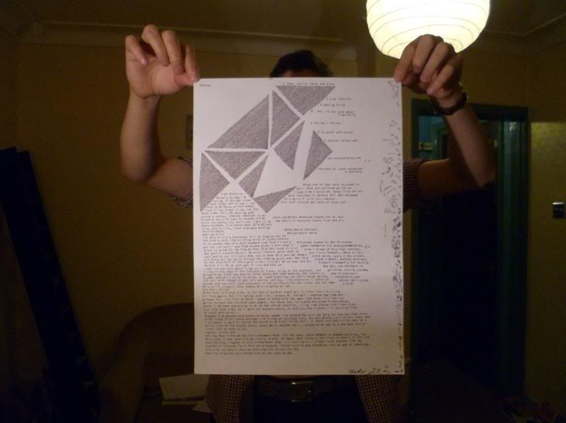
and after the masses of effort getting the sheet to this stage, it was weird then just simply being able to duplicate the whole thing at the push of a button and having multiples of this headfuck...
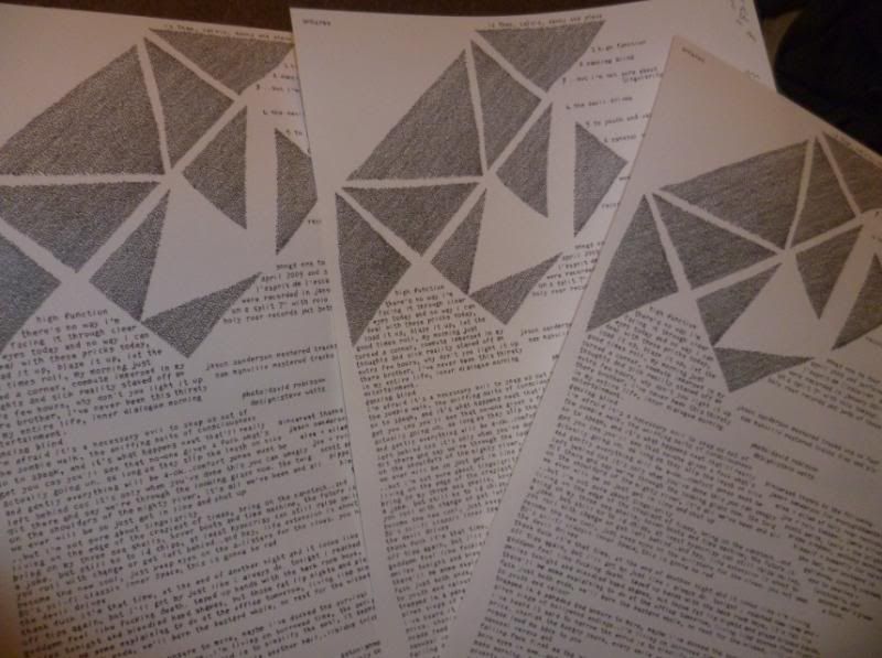
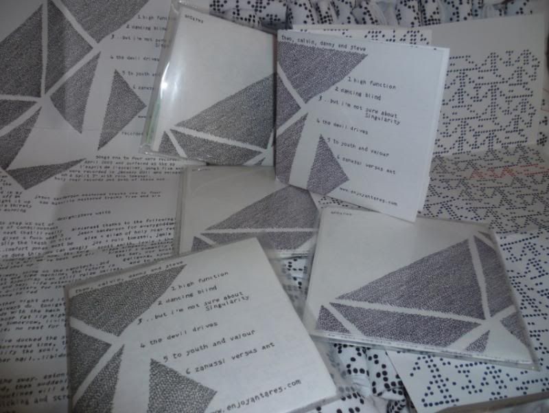
So, inlay drawn out, the next stage was to sort a back-print. as below, i'd initially thought about a big live photo, nice and easy solution, but the kid who's pictures i wanted to use didn't get back to me, and by that time i was already more siked on using multiple pics across the back, 18 or so...this proved a headache for my technological limitations (crappy office computer and MS Paint!!), so decided to go with a modified version of the "dots" shirt design, which was by this time now sorted...some printing jiggery-pokery later and BAM i've got myself an inlay! there was lots more tiny incidental stuff along the way, but without waffling too much (!) that's how it was cobbled together. and on some lovely slightly off-white 120gsm card no less. here's the finished thing, got the front-side unfolded on the left, the back-side unfolded on the right and the inlay at various angles!
and by way of stark opposites, this next design was an absolute dream to do, the whole process was so damn easy! it was a doodle that had no intention of being a shirt design, but by the time i'd finished drawing it all out it was fairly obvious it had to go that way..basically, from our "lines" logo i wanted to plot it out via dots on graph paper and play with the idea.
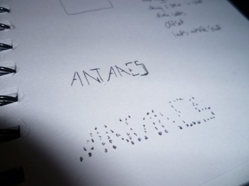
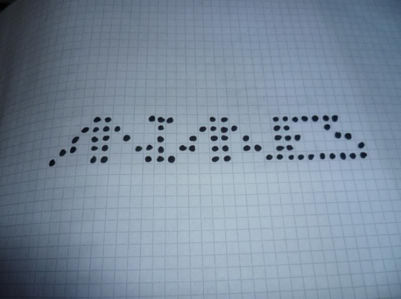
once the rough idea was scribbled down then worked out on the graph paper (best paper in the world!!) a flash of a concept came to me - Repetition!!!
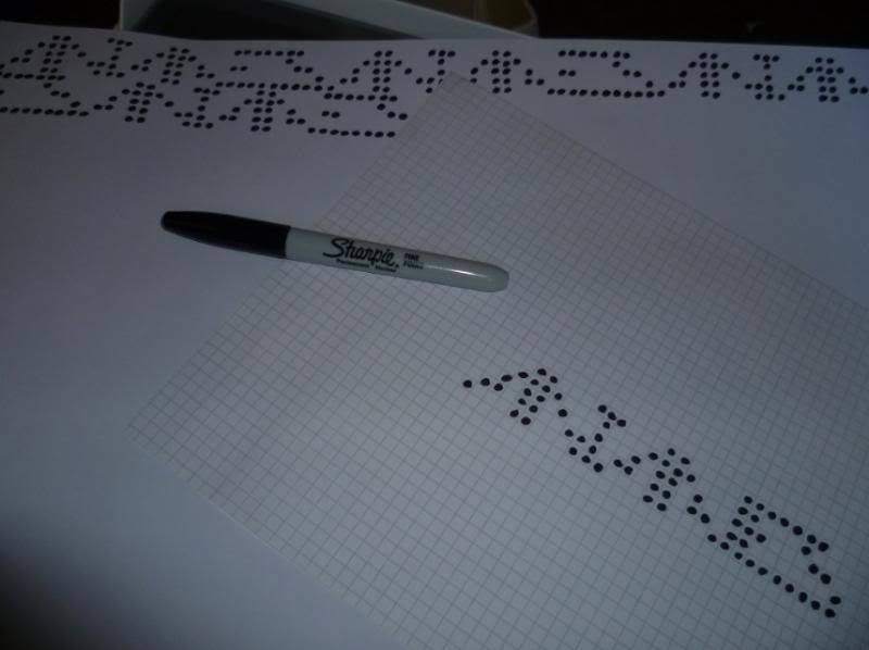
so, back to my tracing technique and across an A3 sheet i drew this out :
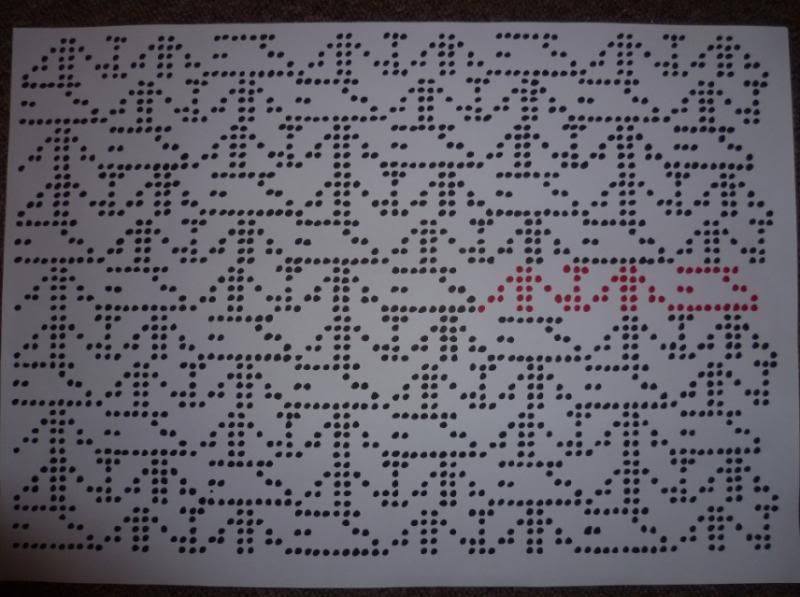
it was only once i'd surfaced from the dazed hypnotism of my muse that i realised the design, though rad, wouldn't really work on a shirt due to the proportions involved...some basic computer duplications of parts of the design were made to facilitate its crossing over to the cloth medium, and it was looking better, but still somehow unfinished. a signature at the bottom was something i'd toyed with for another shirt design idea, so decided to try it with this and seemed to be the thing the design needed to pull it together.
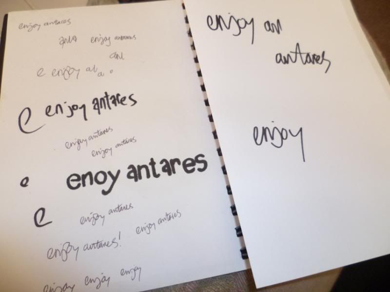
took a few attempts (and an embarassing mis-spelling that our lass revelled in!) but got some scrawl i was happy with after a few attempts so scanned and chopped this together...2 days later the damn thing was a real life teeshirt!!
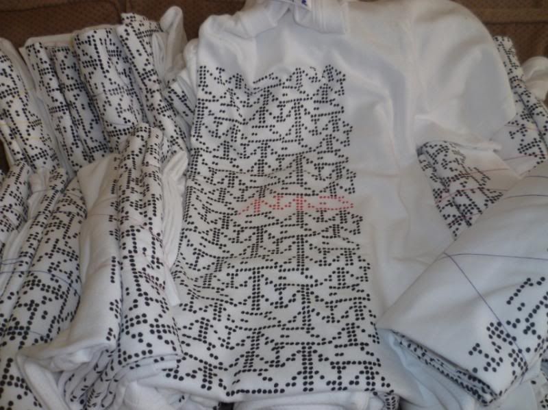
and that's it.....oh, and also the dumb flyers....
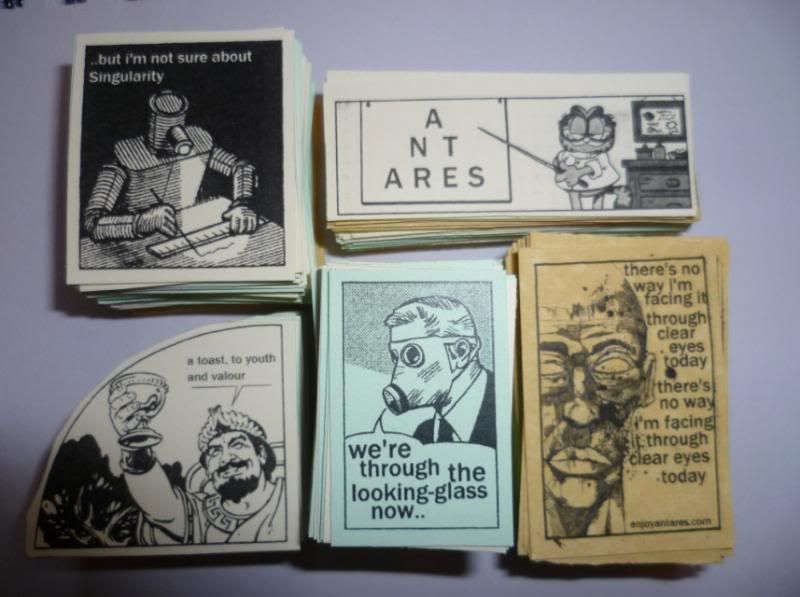
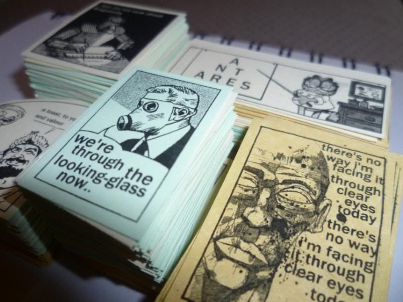
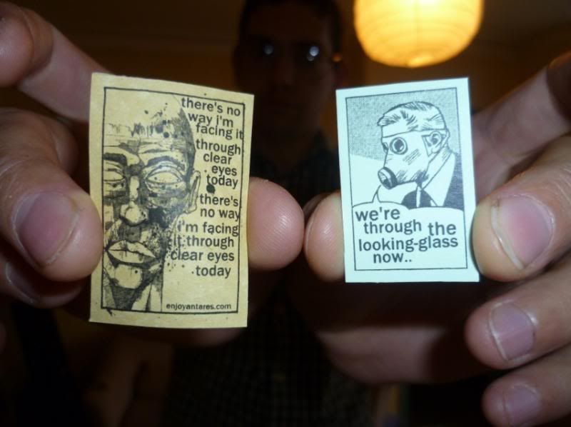
buy things from us!!!
http://antares.bigcartel.com/
steve

Bloody brilliant. I will be purchasing a t-shirt.
ReplyDelete